Our Logo: An Overview
Our logo reinforces all that unites us and is the most visible element of our brand’s visual identity. When used consistently, all elements work together to create a coherent CCP image. This helps increase recognition of and loyalty to the CCP brand.
To ensure our logo maintains its integrity, it may only be treated as designated in these guidelines.
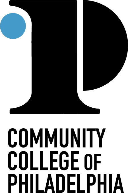
The CCP logo is comprised of two elements: a custom icon and wordmark.
The icon consists of a bold “P,” which stands for Philadelphia, where most of our students are from, and where most of our graduates stay. The “P” is held together by a bold number one, celebrating the individual and collective strength of one community, one college and one city. The contours of the one are inspired by the traditional columns on our Mint Building and the modern, rounded structures found throughout our campus architecture. A light blue dot rises to the top of the “P” on the left side, finding its home within the larger design of the icon. This signifies our community’s ability to rise, relating to our tagline: “Rise from within.”
The wordmark places equal emphasis on the words “Community,” “College” and “Philadelphia.” The word “of” is purposefully offset in a smaller size.
Logo Suite
Please do not attempt to alter or recreate these images in any way. Always use approved images and files for both internal and external audiences.
Horizontal and Vertical Logos
The vertical and horizontal variations are the primary logos to be used whenever possible. These variations can be used interchangeably depending on the needs of the collateral.
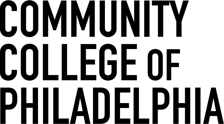
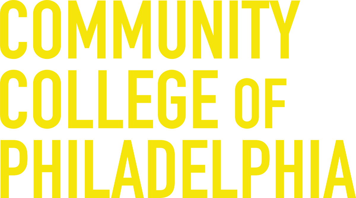
Wordmark
The wordmark may appear on a single line or stacked on three lines. It may be used when the primary vertical and horizontal logos cannot fit within the composition due to size or spacing. It may also appear within a layout that features the icon as a design element.
Clear Space
![]()
When using the CCP logo suite in layout, please take care to ensure proper spacing, leaving clear space, around all elements of the logo. This allows for maximum legibility and brand impact.
Incorrect Logo Usage
Do not manually replicate the College's wordmark.
Do not place the logo on a dark background. In these cases, use the full color reverse version.
Do not stretch or distort the logo in any way.
Do not apply filters or effects to the logo, including gradients and drop shadows.
Do not create your own logo lockup—a lockup is the combination of two or more design elements that are placed in a fixed scale and position to form a single unit with the logo.
Do not manually add the names of offices, divisions, departments or programs outside of the approved brand extension lockup provided by Strategic Communications. You may request these graphics. Read more about brand extensions.